Overview

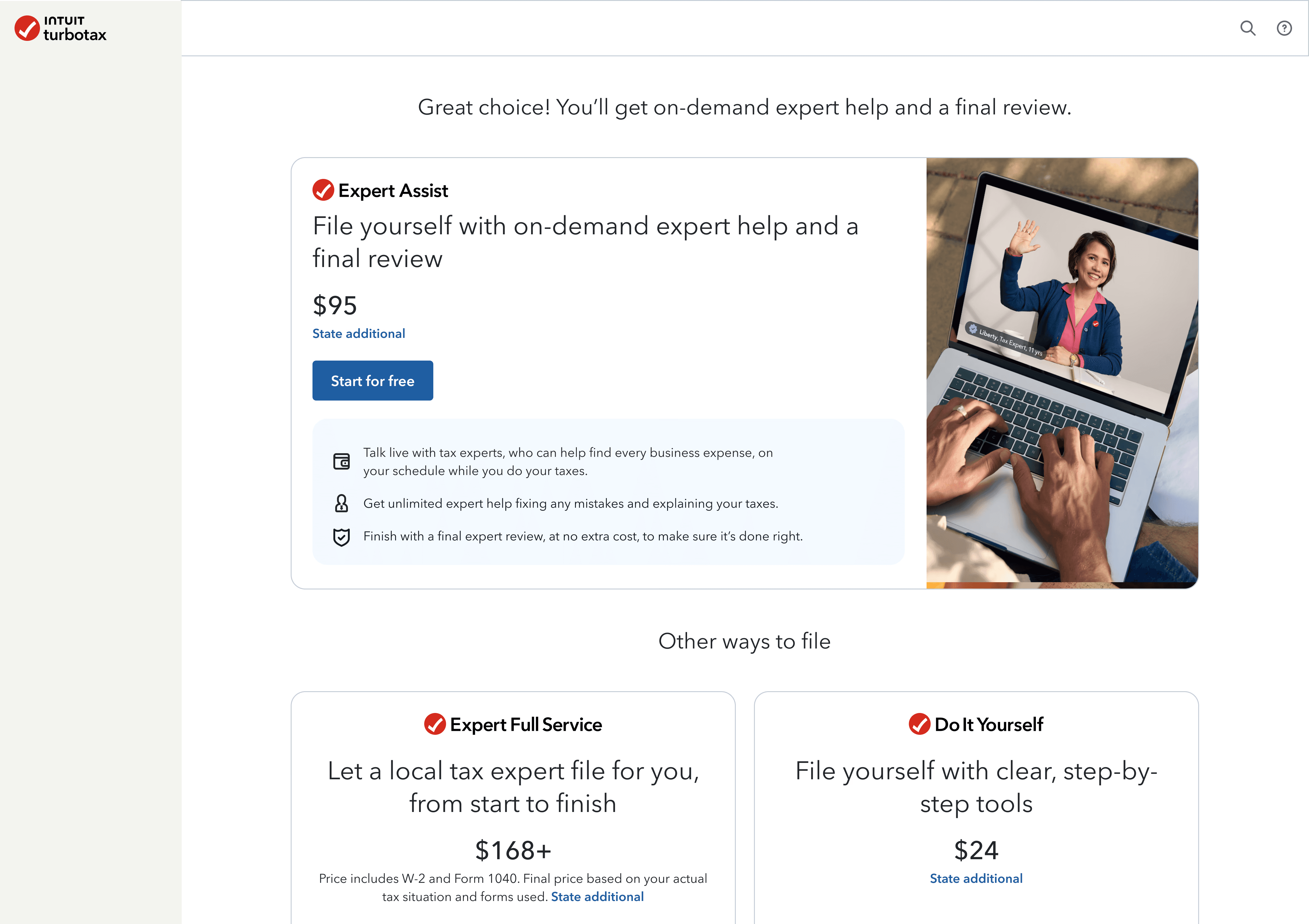
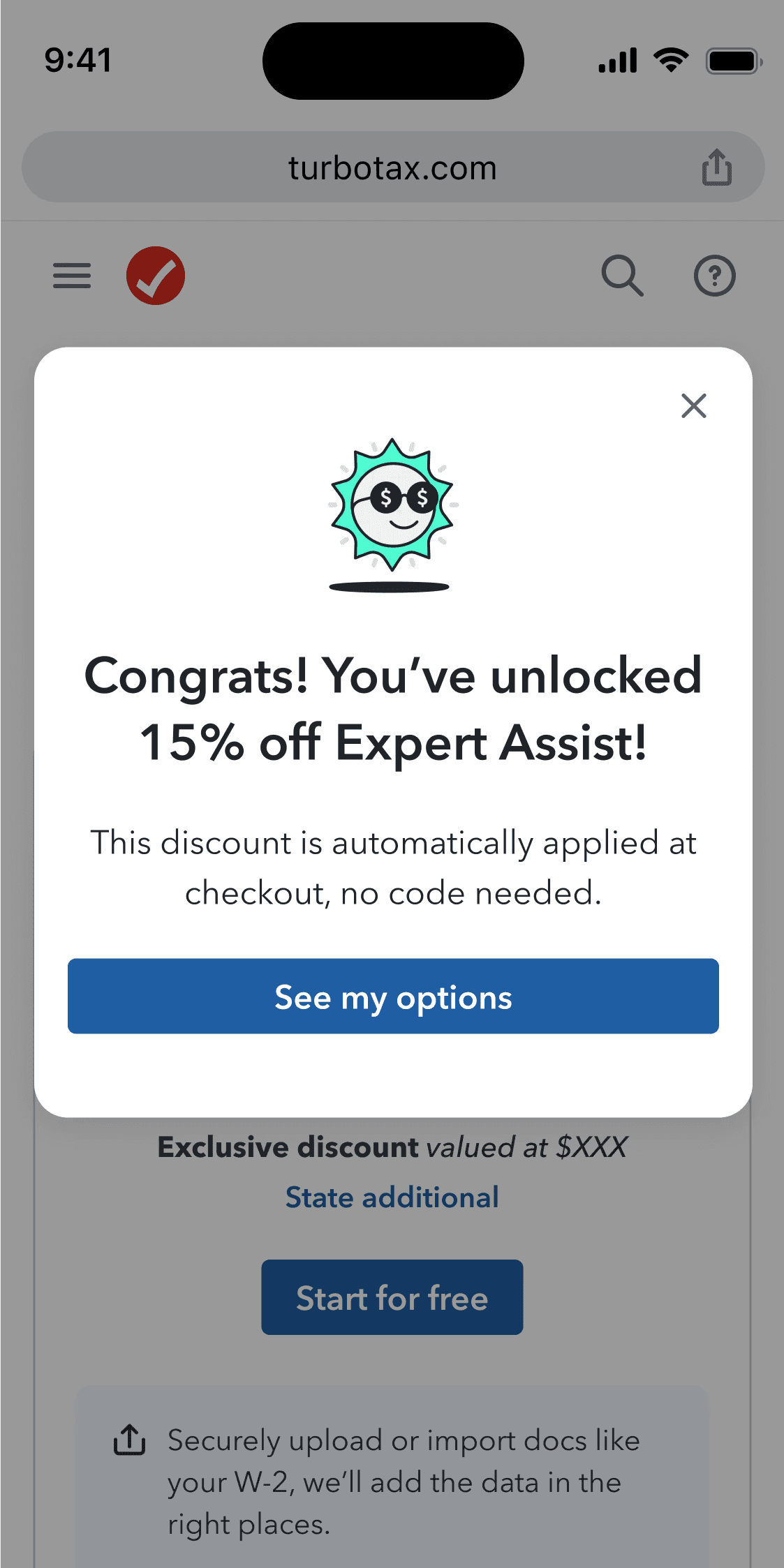
Tailoring upsells so they feel helpful instead of pushy

McAfee's VPN is one of many security tools, often bundled in protection plans. Over time, the tool had fallen behind as updates rolled out to newer products, and was not being maintained by a dedicated team.

I assisted with early research, feature planning, contributing new components to our design system, collaborating with inside and outside stakeholders, and built functioning prototypes and demos for leadership shareouts.

Timeline

Nov—Jan 2024

Device

Mobile

Desktop

Credits

Susanna Huang

Nina Wang

Jeffrey Jose

Jen Barrell

What's a VPN?

Choosing a service felt confusing and overwhelming

We preach simpler taxes, but the first thing customers see is a messy page that doesnt convey the benefits

A VPN (Virtual Private Network) takes your internet request, scrambles it into an encrypted code, and sends it through a private "tunnel" to a remote server.

Without a VPN on an unsafe network, like public Wi-Fi at a cafe or airport, you're broadcasting your online activities, allowing anyone else on it intercept things like login credentials, credit card numbers, or private messages.

Value confusion

Comparison charts didn’t clearly convey benefits

Broken interactions

Hover-based tooltips didn’t work on mobile

Unreadable content

Overflow and formatting issues disrupted readability

Buried CTA

CTAs were placed far below the fold

And around 15 edge case screens, which all look different and make it difficult for devs to update.

Lorem ipsum dolor sit amet, consectetur adipiscing elit, sed do eiusmod tempor incididunt ut labore et dolore magna aliqua. Ut enim ad minim quis nostrud exercitation ullamco laboris nisi ut aliquip exea commodo consequat.

Lorem ipsum dolor sit amet, consectetur adipiscing elit, sed do eiusmod tempor incididunt ut labore et dolore magna.

And around 15 edge case screens, which all look different and make it difficult for devs to update.

Lorem ipsum dolor sit amet, consectetur adipiscing elit, sed do eiusmod tempor incididunt ut labore et dolore magna aliqua. Ut enim ad minim quis nostrud exercitation ullamco laboris nisi ut aliquip exea commodo consequat.

Lorem ipsum dolor sit amet, consectetur adipiscing elit, sed do eiusmod tempor incididunt ut labore et dolore magna.

After collecting every screen we show, I established 3 goals for our new purchase experience.

We need it to be tailored, customers don't understand how this service related to their tax situation
Reduce the amount of edge cases, where can we merge edge cases by just changing a component
Address their biggest concerns immediatly (price, and a clear CTA)

Research

Lorem ipsum

Lorem ipsum dolor sit amet, consectetur adipiscing elit.

Lorem ipsum dolor sit amet, consectetur adipiscing elit, sed do eiusmod tempor incididunt ut labore et dolore magna aliqua. Ut enim ad minim quis nostrud exercitation ullamco laboris nisi ut aliquip exea commodo consequat.

Lorem ipsum dolor sit amet, consectetur adipiscing elit, sed do eiusmod tempor incididunt ut labore et dolore magna.

Toggle your preferences

You can disable specific unimportant words and view multiple definitions side by side for acronyms with more than one meaning. That way you get to decide when to take off the training wheels

Mobile

Bottom sheet > Cards

Lorem ipsum dolor sit amet, consectetur adipiscing elit, sed do eiusmod tempor incididunt ut labore.

Toggle your preferences

You can disable specific unimportant words and view multiple definitions side by side for acronyms with more than one meaning. That way you get to decide when to take off the training wheels

Mobile

Bottom sheet > Cards

Lorem ipsum dolor sit amet, consectetur adipiscing elit, sed do eiusmod tempor incididunt ut labore.

Management

Manage outdated acronyms and approve new ones

What makes Slack so appealing is how you can customize your workspace. Slackronyms should feel the same way. With system-admin roles, you can approve new acronyms and enable/disable them across the org.

Final designs

Lorem ipsum

Lorem ipsum dolor sit amet, consectetur adipiscing elit.

Lorem ipsum dolor sit amet, consectetur adipiscing elit, sed do eiusmod tempor incididunt ut labore et dolore magna aliqua. Ut enim ad minim quis nostrud exercitation ullamco laboris nisi ut aliquip exea commodo consequat.

Lorem ipsum dolor sit amet, consectetur adipiscing elit, sed do eiusmod tempor incididunt ut labore et dolore magna.

Reflection

Despite the internal hype, priorities changed and the revamp was shelved.

In my research, ETC Missing parts, hidden features and an oversimplified UI that killed engagement that all contributed to the product failure

Focus on what really matters to users

No matter how well we convey the features, the images we use or the hierachy of the product, in the end the biggest motivator for purchases was price. We spent too long trying to avoid showing less attractive prices but in the end when you make that info the most accessible, it drove people to look at why there was a price difference. It wasn't an obsticle for

Lorem

If I find myself needing to align a team on layout and abstract concepts, I feel confident that I can use sketch workshops now confident in sketching to rapid-fire ideas and align stakeholders from other teams.

Lorem

I recognize that designing to earn trust is a slow process and cannot be tracked via a single metric but rather by a combination of design empathy and user vulnerability.

Up next

Teaching Slack your work lingo

© 2025 Clayton Harding

Reading this was a test. You passed ツ