
McAfee's VPN tool — a core product in the protection suite, was left neglected due to resource constraints. As the rest of the protection suite evolved, VPN was being left behind. To address the amassed tech debt, leadership greenlit a full redesign initiative.
I was brought onto the newly formed VPN team to assist with initial research, feature planning, and end-to-end design implementation.
3 product designers
2 UX researchers
1 Copywriter
Product Designer
Jan 2024 - 1 month sprint
Background on VPNs
It's like driving a car with tinted windows.
Internet providers also want this information to sell to advertisers. It’s part of their business model.
Common tasks like online banking can result in your accounts being breached.
Image
How a VPN works
CSAT feedback showed users lack of confidence in their VPN tool, feeling that it isn't doing anything when turned on. The value for a premium protection service felt invisible, resulting in subscriptions lapsing.

Image
McAfee's Current VPN design
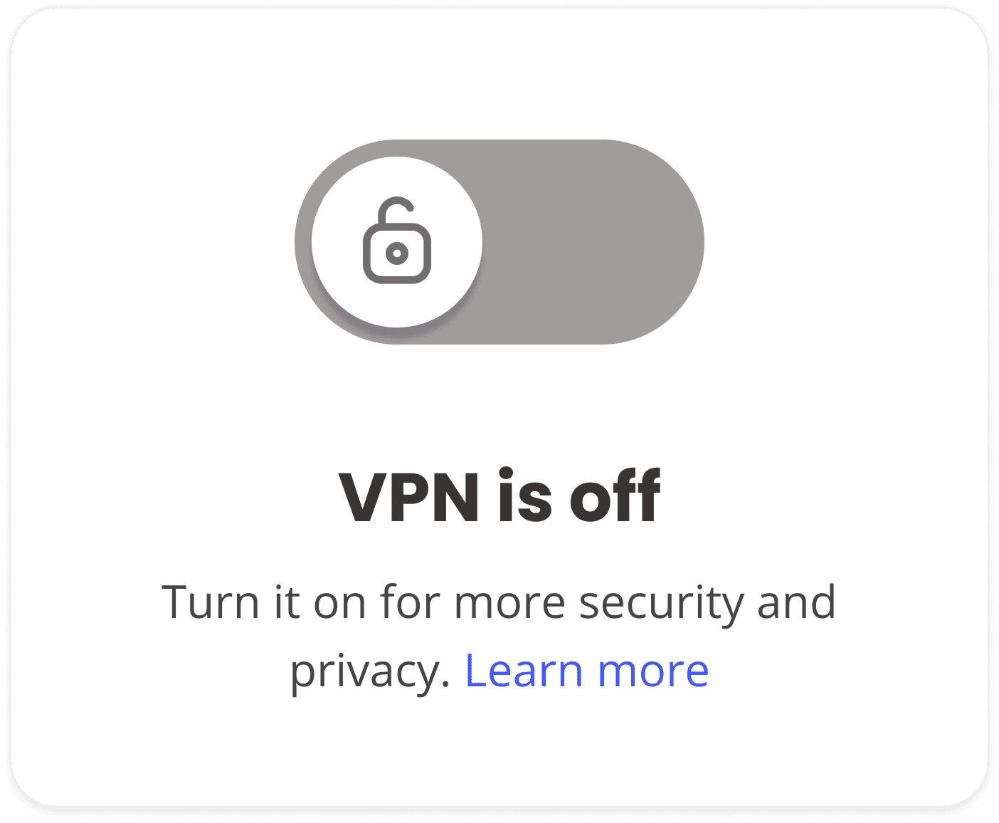
Image
McAfee's Current VPN design
Setting a North Star goal
Discovery
I sat down with TunnelBear, a lead VPN service, to get insight on the people who use VPN's and their struggles.
I learned if we overeducate users with technical VPN details, it builds skepticism among newcomers. We need to build trust with their VPN by showing immediate value allowing users to explore additional features as their confidence grows.

Our users need to be comfortable with their VPN before
we introduce them to more complex features.

People need more than a toggle to know they're
being protected, they need constant reassurance.

VPN users range from "set it and forget it" types to tech-savvy ones who explore deeper customization like "split tunneling" or auto-connecting to networks.
With our new insights, I mapped out a typical VPN user's E2E flow to see where we can find opportunities to build confidence when using their VPN. This is the moment I discovered a big uh-oh :(
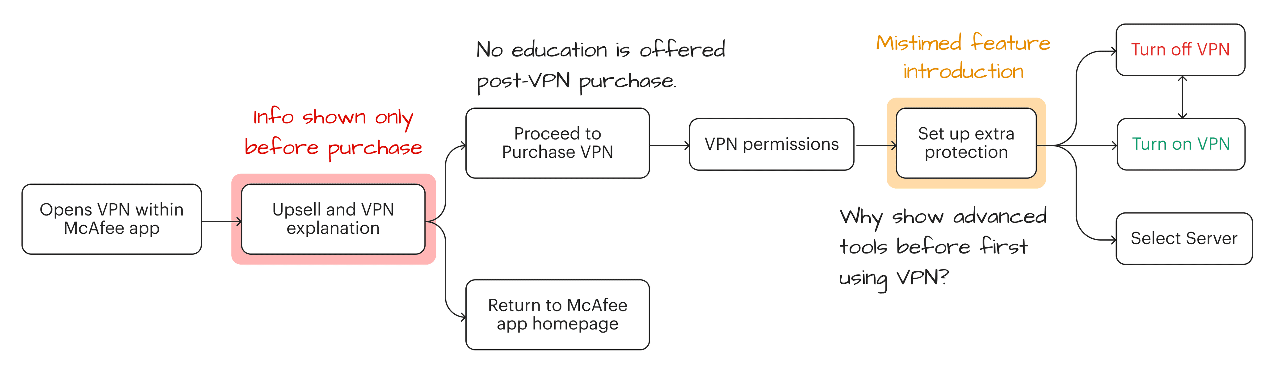
Image
Old: Showing information only before making a purchase

Image
New: Setup guides + spotlighting advanced features

Image
Compilation of 4 sketch sessions
Interactive
V1 Sketch compared to final output
¯\_(ツ)_/¯
This case study is still in progress
The groundwork is there, but between you and me, it looks choppy!
Check back in like a week or two!
Final designs
Making education always available when activating VPN for the first time.
Lorem ipsum dolor sit amet, consectetur adipiscing elit, sed do eiusmod tempor incididunt ut labore et dolore magna aliqua. Ut enim ad minim veniam, quis nostrud exercitation ullamco laboris nisi ut aliquip.
Imagine you just purchased VPN for the first time.

When VPN activates, we show contextual info that reassures users are protected and delivers immediate value.


Final designs
Making VPN's less invisible with motion.
Testing with users
"What does fastest mean? I need an actual location."

Image
Old: Connect to fastest regardless of country

Image
New: Showing country + fastest indication
Personal reflection
Despite the hype, priorities changed and VPN's revamp was shelved. But it wasn't a waste.
I often skipped sketching thinking it had no impact on final designs, but I learned the actual purpose of sketching is to ask for feedback in a casual setting. It won't look good but it will weed out bad ideas.
There is a balance between saying what we as a business want users to know vs what a user wants to know. This project helped me learn how to use metaphors on boring language into legible content Also, People hate to read.
This reflective method summarizes "what went well and what to continue doing" (Rose), "What I should I should do in future projects" (Buds) and "what went wrong and should be avoided" (Thorns). This framework has now become a habit where my approach to new projects feels much more intentional rather than "let's try this and see how it works".
© 2025 Clayton Harding
Reading this was a test. You passed ツ